MY PORTFOLIO
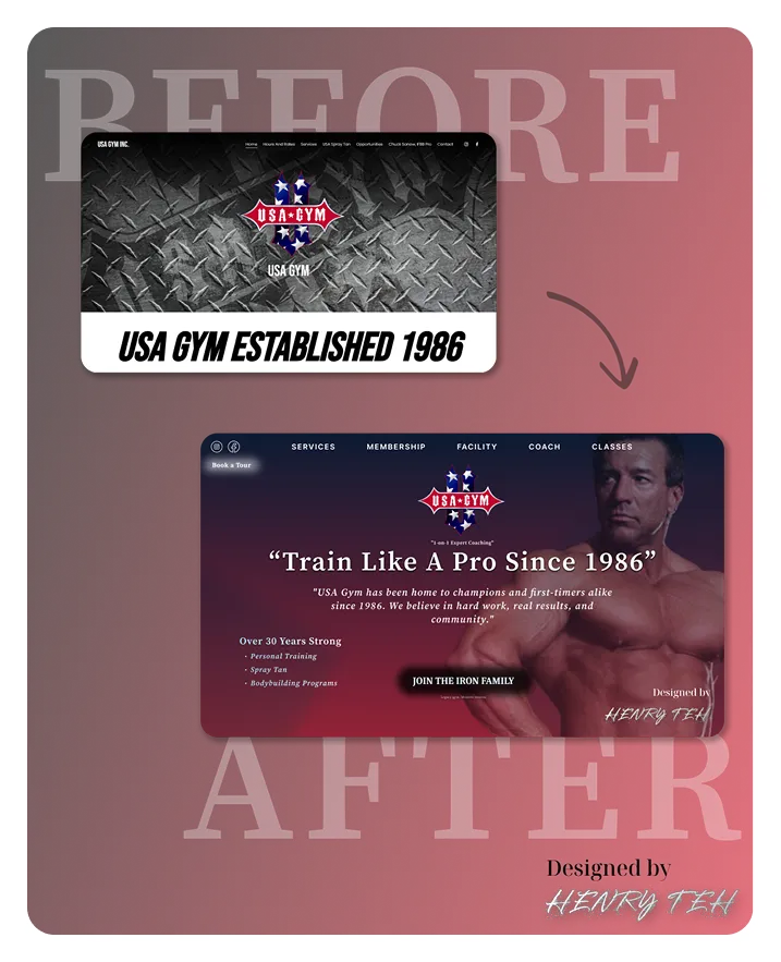
The old site said: “Established 1986.” But nothing felt strong about it. 😮💨
So I gave it a transformation. Not just a facelift — a full branding workout.
🛠️ Here’s what changed:
Added a power headline: “Train Like A Pro Since 1986”
Upgraded font hierarchy for instant clarity
Integrated Arnold-style visual hook to boost trust & energy
Clear navigation bar (Services, Coach, Classes...)
CTA button now says “Join the Iron Family” — emotional, not generic
Brand story is now visible, not buried
This is what happens when you lift more than weights — you lift the brand experience.
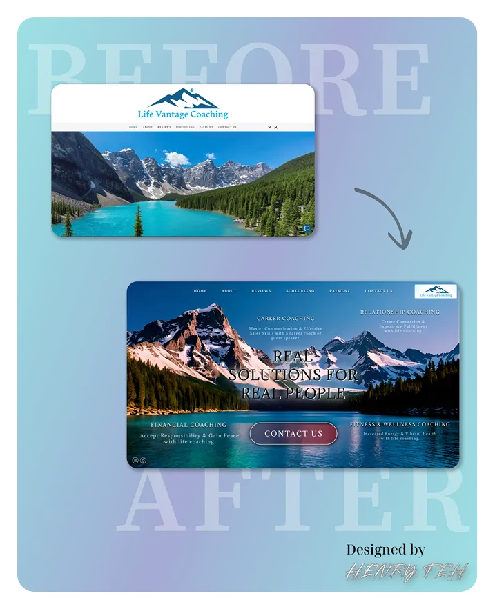
Some pages show mountains. Others help you move them. 🏔️
The old site had the nature, but didn’t speak to the people.
So I rebuilt it from a user’s view. What would someone struggling in life need to see in that first 5 seconds?
Here’s what I focused on:
✔️ A human headline — “Real Solutions for Real People”
✔️ Visible service list — Career, Finance, Relationships, Wellness
✔️ A clean navigation bar with added “Reviews” & “Payment” tabs
✔️ Stronger text overlay with contrast for accessibility
✔️ A bold CTA: “Contact Us” in center stage
✔️ Layout built with trust, not just aesthetics
This redesign wasn’t just about looking good. It’s about feeling seen.
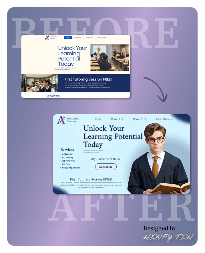
Some tutoring websites talk at students. This one speaks to them. 👓📖
The “Before” version said the right words... but it didn’t look like it could teach you anything.
So I redesigned the whole feel — to make it feel like a place parents and students can trust.
Here’s what improved:
🟢 New visual structure – better info grouping and readability
🟢 Replaced classroom photo with focused student visual (empathy wins)
🟢 Service list made compact and clear:
K-8 Tutoring
9-12 Tutoring
SAT/ACT Prep
College App Help
🟢 New Subscribe section added to grow leads
🟢 Color palette tuned for calm + clarity
🟢 Font and layout now say “we’re legit” not “template default”
This redesign wasn’t just cosmetic — It’s about giving users confidence before the first session even starts.
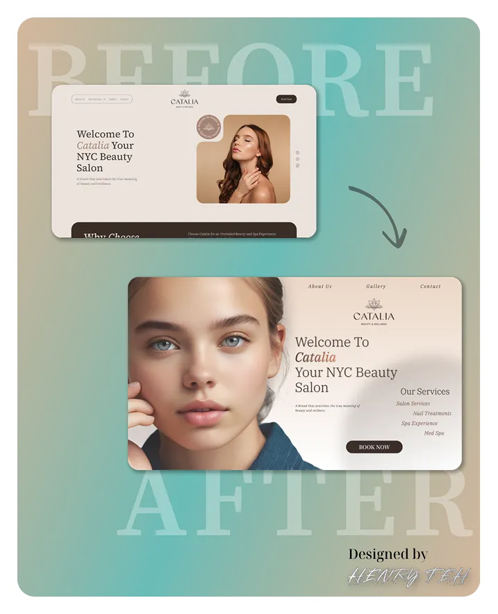
Beauty is in the details — and your homepage should reflect that. 💫
The “Before” version gave basic salon info, but didn’t feel like Catalia. Didn’t feel soft, warm, or premium.
So I redesigned it to feel like a calm exhale — just like the first breath after stepping into a real spa.
🔍 Here's what changed:
✔️ Swapped generic model for realistic close-up, to build trust
✔️ Made typography more spacious & elegant
✔️ Re-arranged layout to bring services up front:
Salon, Nails, Spa, Med Spa
✔️ CTA button now easier to find — not hidden at top
✔️ Used soft background gradient for atmosphere
✔️ Clean nav bar: only what’s essential
This wasn’t just about looking nice. It was about feeling luxurious before the appointment even starts.
The menu might bring them in. But the mood makes them stay.
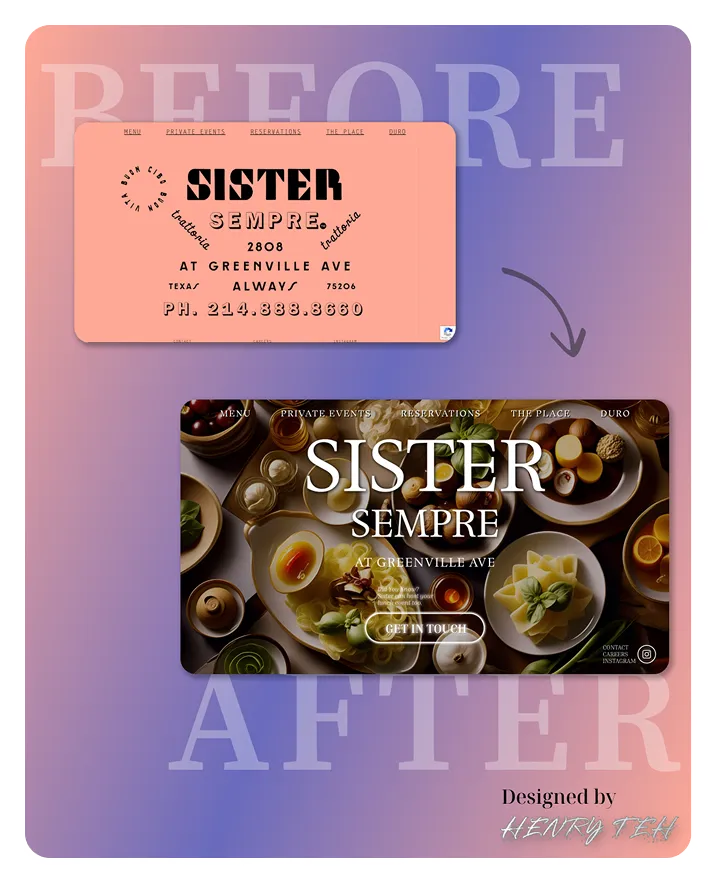
SISTER SEMPRE had a cool name — but the old homepage didn’t feel like a place you’d actually want to eat.
Just pink space. No flavor. No photos. No hunger.
So I redesigned it to feel like food. The kind you smell before it even hits the table.
Here’s what I cooked up:
👨🍳 Full-screen table photo = sets emotional tone instantly
👨🍳 Font rework: now reads warm, elegant, Italian-inspired
👨🍳 CTA “GET IN TOUCH” added at eye level
👨🍳 Subheading that teases brand story, not just address
👨🍳 Footer includes contact, Instagram, careers = complete structure
👨🍳 Better nav bar: Reservations + Events feel more intentional
This is more than a homepage — it’s the first taste of the experience.
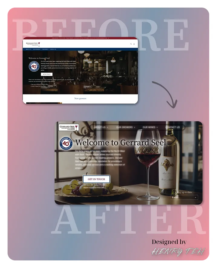
“We’ve been around 40 years… but the homepage didn’t show that.”
That’s what the client told me. So I redesigned their site to feel like what they actually sell: Warmth. Connection. Experience.
✅ Real wine photo, not a generic
background
✅ One clear “Get In Touch” CTA
✅ Clean storytelling layout
✅ Visible brand badge that adds trust
They didn’t need a rebrand. They just needed clarity.
Before: a webpage. After: a tasting room — in pixels.e
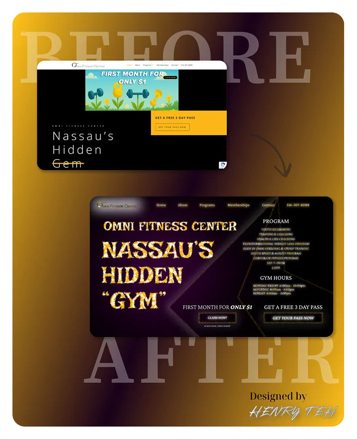
“Strong programs. Weak homepage.”
That’s what the owner told me.
So I turned the site from invisible… to impactful.
✅ Hero headline that shouts
✅ Visible action buttons
✅ Offer + programs + hours all above the fold
✅ Real structure, not just boxes
Before:
"Okay, cool... another gym site."
After:
“Yo — this place looks serious.”
🔥 Offer? Clear.
🔥 Programs? Listed.
🔥 Button? Right where I expect it.